The Model Wasn’t Wrong. I Was Asking the Wrong Question.
How a cancer trial and one extra variable changed the way I think about causality.

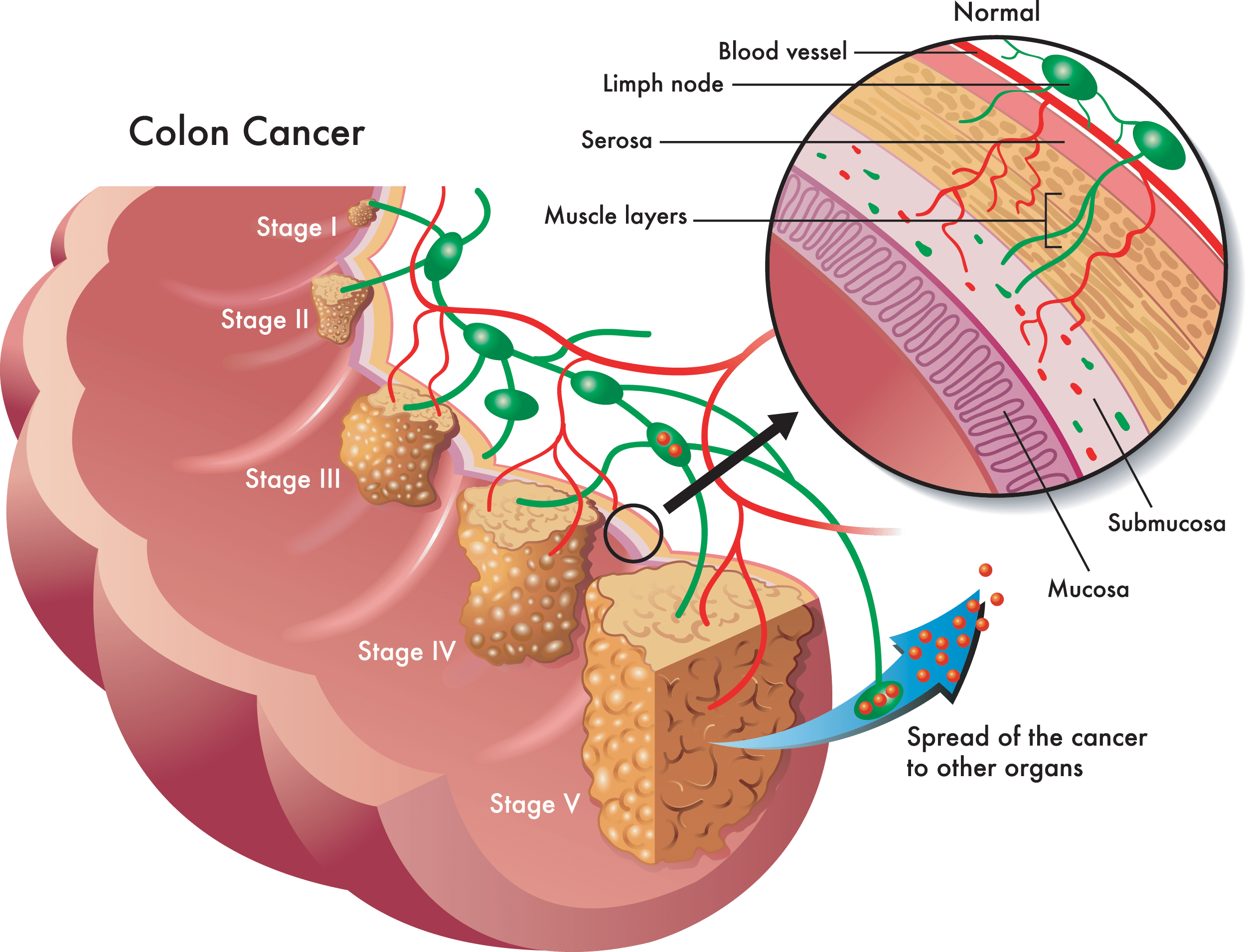
A few weeks ago, I was re-analyzing a classic colon cancer trial from 1990.
Everything was going smoothly.
I loaded the data, fit a Cox model, and reproduced the published result almost perfectly. Patients who received chemotherapy had a substantially lower risk of death. The hazard ratio came out to 0.69. The original paper reported roughly 0.67.
Great.
Then I made what felt like a responsible modeling decision.
I added another variable.
The hazard ratio jumped to 1.10.
The treatment had apparently gone from reducing mortality by 31% to increasing it by 10%.
Same patients.
Same outcome.
Same dataset.
Just one extra column.
At first, I assumed I had made a coding mistake. Maybe I’d miscoded the treatment indicator. Maybe I had accidentally reversed a category. Maybe I had forgotten to handle missing values.
I checked everything.
The code was fine.
The problem was much worse.
The model was lying to me.
What I got wrong last time
This isn’t the first time I’ve worked with colorectal cancer data. Last semester I built an interactive risk dashboard with about a thousand patients, eleven variables, a logistic regression model, parallel coordinates plots, and a what-if simulator where you could slide a vitamin C value up and down and watch the risk number change in real time.
The project was a good one for the class. It was also, in hindsight, a quiet category error.
We asked questions like which dietary combinations appear protective? and how does family history amplify other risk factors? Those sentences sound predictive, but they aren’t. “Protective” is a causal claim. “Amplify” is a causal claim. They are statements about what would happen if you intervened, not statements about what is correlated in a snapshot of patients. We answered them with logistic regression on cross-sectional data, a method that, no matter how well-tuned, cannot actually distinguish prediction from causation.
The dashboard’s biggest tell was the simulator. Sliding vitamin C from 100 to 200 felt like an intervention. It wasn’t. It was a conditional prediction in an observational dataset (what is the predicted risk for patients who happen to report vitamin C around 200), not what would happen to your risk if you started eating more vitamin C tomorrow. The first question is rung 1 of Pearl’s ladder. The second is rung 2. They look identical in a dashboard and are completely different problems mathematically.
The Moertel trial forced me to actually live in rung 2, and that’s where I tripped over the bug below.
The trap
If you’ve spent time around predictive modeling, you’ve probably developed a healthy instinct:
If a variable predicts the outcome, control for it.
Most of the time, that feels sensible.
In this trial, the variable I added was cancer recurrence.
Patients who experienced recurrence were far more likely to die. The relationship was strong, clinically meaningful, and statistically obvious.
Why wouldn’t I adjust for it?
That question turns out to be the entire lesson.
A quick primer: three shapes of cause and effect
Most of causal inference reduces to recognizing one of three patterns in a three-variable diagram. Each pattern has a different rule for what belongs in your model. Adam Kelleher’s Lecture 3 builds the entire back-door framework out of these three primitives, and they’re worth committing to memory.
Chain. treatment → recurrence → death. Information flows from treatment to death through recurrence. Recurrence is a mediator. It’s part of the causal pathway. If you condition on it, you block the very path you wanted to measure.
Fork. frailty → treatment and frailty → death. A hidden factor causes both who gets a given treatment and who dies. Frailty is a confounder. It creates a spurious correlation between treatment and outcome until you adjust for it. This is the case nearly every regression textbook talks about, and it’s where “control for it” became a default instinct.
Collider. treatment → recurrence ← frailty. Two arrows point into the same node. Recurrence is a collider between treatment and frailty. The two parents are unrelated to each other in the general population. But the moment you condition on the collider, a fake correlation appears between them.
One sentence captures the rulebook: adjust for confounders, leave mediators alone, never condition on colliders.
What conditioning actually does
The word “control” is doing a lot of hidden work in statistics. When a regression controls for a variable, it is doing something specific: looking only at units that share roughly the same value of that variable, then asking what the relationship between the other variables looks like within that slice.
Kelleher’s lecture on d-separation makes this concrete. Conditioning on a variable opens or closes paths in the causal graph depending on what kind of node it is:
Conditioning on a chain node blocks the path. Information no longer flows through it.
Conditioning on a fork node blocks the path. The common cause is held fixed, so the spurious dependency it created disappears.
Conditioning on a collider opens the path. The two parents become statistically dependent, even though no causal arrow connects them.
The third one is the counterintuitive one. Adding a variable to a regression doesn’t only add information. It can create a relationship that wasn’t there before. This is the exact mechanism that broke my Cox model, and it’s the same mechanism that would have quietly broken every “protective factor” interpretation in the CRC dashboard if anyone had taken those numbers at face value.
Why recurrence is a collider here
In causal inference, a collider is a variable that is caused by two separate things.
In this case:
Treatment influences recurrence.
A patient’s underlying biological risk influences recurrence.
That hidden biological risk could include immune function, undiagnosed comorbidities, tumor aggressiveness, genetics, and dozens of factors we never fully observe.
The causal picture looks like this:
treatment ──→ recurrence ←── frailty
                  │
                  ↓
                death
Both treatment and frailty point into recurrence.
That makes recurrence a collider.
And colliders are sneaky.
Why randomization is special, in graph terms
The magic of a randomized trial is that treatment assignment is independent of patient frailty.
Before treatment begins, the two groups are balanced on average.
Some patients are healthier.
Some patients are sicker.
Randomization spreads them out evenly.
That balance is incredibly valuable.
Unfortunately, conditioning on a collider can destroy it.
This is exactly what the dashboard project did not have. Our CRC data was cross-sectional and observational. Anyone in the high-vitamin-C stratum was also, on average, the kind of person who tracks nutrition closely, exercises more, and sees doctors more often, all hidden causes of both the predictor and the outcome. Most of the effort in observational causal inference is reconstructing what randomization gives you for free.
Why conditioning breaks everything
Let’s focus only on patients who did not recur.
Imagine two such patients.
The first received chemotherapy and never recurred.
The second received placebo and never recurred.
The placebo patient had no pharmaceutical help preventing recurrence.
So if they remained recurrence-free, they were probably biologically fortunate to begin with.
The treated patient had two ways to arrive in the non-recurrence group:
They were biologically fortunate.
The treatment helped them.
The placebo patient had only the first option.
As a result, among non-recurrers, the placebo group ends up looking healthier on average.
You have unintentionally created an imbalance that randomization had previously eliminated.
The same logic works in reverse among patients who did recur.
If recurrence happened despite chemotherapy, those patients are often the highest-risk individuals. Many of the lower-risk treated patients were filtered out because treatment prevented recurrence in the first place.
Suddenly the treated group looks frailer.
Not because the treatment harmed them.
Because the way we sliced the data manufactured the difference.
A cheat sheet for what to control for
Once you can spot the three shapes, the modeling decision becomes mechanical.
Confounder: has arrows into both treatment and outcome. Adjust for it.
Mediator: sits between treatment and outcome. Leave it out, unless you specifically want the direct effect.
Collider: has arrows from treatment and from the outcome (or a hidden cause of the outcome). Never condition on it.
Adjust for confounders is the part most courses teach well. Never condition on colliders is the part most analysts learn the hard way, usually by accident, the way I did.
The one-line bug
The most frustrating part is how small the mistake was.
The difference between the correct model and the incorrect model was literally one variable.
The correct model estimated:
HR = 0.69 (95% CI: 0.55–0.87)
The incorrect model estimated:
HR = 1.10 (95% CI: 0.87–1.39)
One extra covariate transformed a beneficial treatment into an apparently harmful one.
If I had glanced only at the second result, I might have walked away believing the exact opposite of reality.
The lesson I wish more people learned
Many statistics courses teach regression as a tool for “controlling for confounders.”
That’s true.
The problem is that students often leave with a dangerous shortcut:
More adjustment is better adjustment.
It isn’t.
Some variables should absolutely be controlled for.
Others should never be touched.
A regression model is not a garbage disposal where every available column gets thrown in.
Every variable represents a causal assumption.
Every variable changes the question you’re asking.
The hardest part of causal inference is not fitting the model.
It’s deciding what belongs in it.
Draw the picture first
The best habit I’ve picked up from causal inference is embarrassingly simple.
Before touching the data, draw a picture.
Not a complicated diagram.
Not a hundred-node network.
Just a few arrows on paper.
For this study, the DAG would have immediately revealed the problem:
treatment ─────────→ death
    │                  ↑
    └→ recurrence ─────┘
              ↑
            frailty
The moment you sketch this, recurrence stops looking like an innocent covariate.
It’s a mediator.
It’s a collider.
And it’s a warning sign.
The picture answers the modeling question before the software ever gets involved.
If I had drawn a similar diagram for the CRC dashboard a year ago (even a sloppy one) would have flagged the problem with the what-if simulator immediately. Diet, exercise, family history, and outcomes all sit in a tangle of forks and colliders that no slider can untangle. The visualization was honest about correlation. The framing implied causation. Drawing the picture would have caught the mismatch before we wrote a single line of Shiny.
Why this matters outside clinical trials
Most people will never analyze a cancer trial.
Almost everyone will eventually analyze something with collider bias.
Hiring data.
Marketing funnels.
User retention.
Medical records.
Education outcomes.
Loan approvals.
Any system where you condition on something that sits downstream of your treatment or exposure can produce the same illusion.
The details change.
The trap stays the same.
The takeaway
The biggest mistakes in data science are rarely coding mistakes.
They’re thinking mistakes.
My code ran perfectly.
The model converged.
The diagnostics looked fine.
The hazard ratio had confidence intervals and decimal places and all the usual signs of legitimacy.
And it was still wrong.
Ever since this project, I’ve adopted a simple rule:
Before I fit a model, I draw the arrows.
Five minutes with a pencil can save weeks of confidently explaining the wrong result.
Sometimes the most important step in a machine learning or statistics project isn’t the model.
It’s the sketch you make before you open your laptop.
A note of thanks: most of what I understand about causal inference comes from Adam Kelleher’s course at Columbia. He is one of the best professors I have had: patient, deeply technical without being intimidating, and obsessed with the question “but what does the model actually assume?” If anything in this post made sense to you, the credit belongs to his teaching. Any remaining confusion is mine.
Code: the full re-analysis is at github.com/rishika1099/Colon-Cancer-Trial-Causal-Analysis. The earlier predictive CRC dashboard project is at github.com/rishika1099/Colorectal-Cancer-Risk-Analysis.